A growing number of tools enable users to make online data representations, like charts, that are accessible for people who are blind or have low vision. However, most tools require an existing visual chart that can then be converted into an accessible format.
This creates barriers that prevent blind and low-vision users from building their own custom data representations, and it can limit their ability to explore and analyze important information.
A team of researchers from MIT and University College London (UCL) wants to change the way people think about accessible data representations.
They created a software system called Umwelt (which means "environment" in German) that can enable blind and low-vision users to build customized, multimodal data representations without needing an initial visual chart.
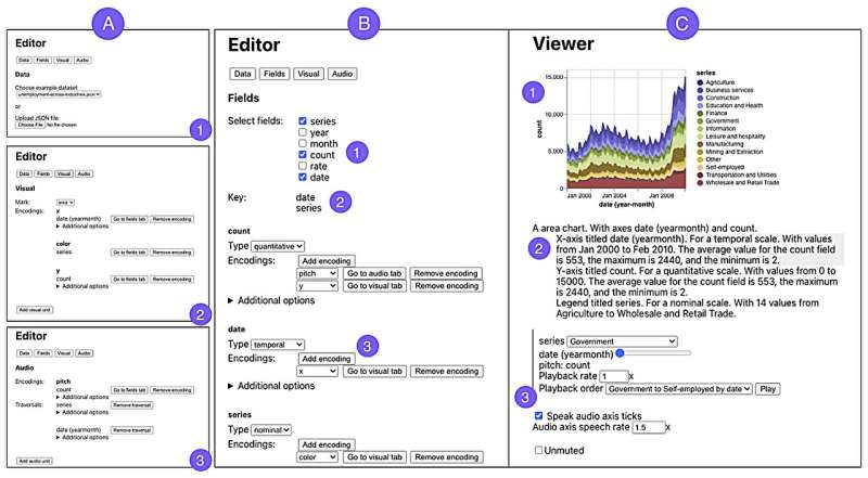
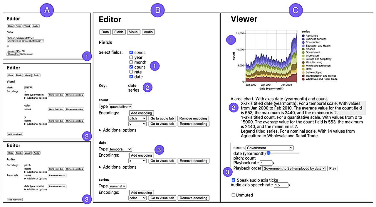
Umwelt, an authoring environment designed for screen-reader users, incorporates an editor that allows someone to upload a dataset and create a customized representation, such as a scatterplot, that can include three modalities: visualization, textual description, and sonification. Sonification involves converting data into nonspeech audio.
The system, which can represent a variety of data types, includes a viewer that enables a blind or low-vision user to interactively explore a data representation, seamlessly switching between each modality to interact with data in a different way.
The researchers conducted a study with five expert screen-reader users who found Umwelt to be useful and easy to learn. In addition to offering an interface that empowered them to create data representations—something they said was sorely lacking—the users said Umwelt could facilitate communication between people who rely on different senses.
"We have to remember that blind and low-vision people aren't isolated. They exist in these contexts where they want to talk to other people about data," says Jonathan Zong, an electrical engineering and computer science (EECS) graduate student and lead author of a paper introducing Umwelt.
"I am hopeful that Umwelt helps shift the way that researchers think about accessible data analysis. Enabling the full participation of blind and low-vision people in data analysis involves seeing visualization as just one piece of this bigger, multisensory puzzle."
Joining Zong on the paper are fellow EECS graduate students Isabella Pedraza Pineros and Mengzhu "Katie" Chen; Daniel Hajas, a UCL researcher who works with the Global Disability Innovation Hub; and senior author Arvind Satyanarayan, associate professor of computer science at MIT who leads the Visualization Group in the Computer Science and Artificial Intelligence Laboratory.
The paper will be presented at the ACM Conference on Human Factors in Computing (CHI 2024), HELD May 11–16 in Honolulu. The findings are published on the arXiv preprint server.
De-centering visualization
The researchers previously developed interactive interfaces that provide a richer experience for screen reader users as they explore accessible data representations. Through that work, they realized most tools for creating such representations involve converting existing visual charts.
Aiming to decenter visual representations in data analysis, Zong and Hajas, who lost his sight at age 16, began co-designing Umwelt more than a year ago.
At the outset, they realized they would need to rethink how to represent the same data using visual, auditory, and textual forms.
"We had to put a common denominator behind the three modalities. By creating this new language for representations, and making the output and input accessible, the whole is greater than the sum of its parts," says Hajas.
To build Umwelt, they first considered what is unique about the way people use each sense.
For instance, a sighted user can see the overall pattern of a scatterplot and, at the same time, move their eyes to focus on different data points. But for someone listening to a sonification, the experience is linear since data are converted into tones that must be played back one at a time.
"If you are only thinking about directly translating visual features into nonvisual features, then you miss out on the unique strengths and weaknesses of each modality," Zong adds.
They designed Umwelt to offer flexibility, enabling a user to switch between modalities easily when one would better suit their task at a given time.
To use the editor, one uploads a dataset to Umwelt, which employs heuristics to automatically creates default representations in each modality.
If the dataset contains stock prices for companies, Umwelt might generate a multiseries line chart, a textual structure that groups data by ticker symbol and date, and a sonification that uses tone length to represent the price for each date, arranged by ticker symbol.
The default heuristics are intended to help the user get started.
"In any kind of creative tool, you have a blank-slate effect where it is hard to know how to begin. That is compounded in a multimodal tool because you have to specify things in three different representations," Zong says.
The editor links interactions across modalities, so if a user changes the textual description, that information is adjusted in the corresponding sonification. Someone could utilize the editor to build a multimodal representation, switch to the viewer for an initial exploration, then return to the editor to make adjustments.
Helping users communicate about data
To test Umwelt, they created a diverse set of multimodal representations, from scatterplots to multiview charts, to ensure the system could effectively represent different data types. Then they put the tool in the hands of five expert screen reader users.
Study participants mostly found Umwelt to be useful for creating, exploring, and discussing data representations. One user said Umwelt was like an "enabler" that decreased the time it took them to analyze data. The users agreed that Umwelt could help them communicate about data more easily with sighted colleagues.
"What stands out about Umwelt is its core philosophy of de-emphasizing the visual in favor of a balanced, multisensory data experience. Often, nonvisual data representations are relegated to the status of secondary considerations, mere add-ons to their visual counterparts. However, visualization is merely one aspect of data representation.
"I appreciate their efforts in shifting this perception and embracing a more inclusive approach to data science," says JooYoung Seo, an assistant professor in the School of Information Sciences at the University of Illinois at Urbana-Champagne, who was not involved with this work.
Moving forward, the researchers plan to create an open-source version of Umwelt that others can build upon. They also want to integrate tactile sensing into the software system as an additional modality, enabling the use of tools like refreshable tactile graphics displays.
"In addition to its impact on end users, I am hoping that Umwelt can be a platform for asking scientific questions around how people use and perceive multimodal representations, and how we can improve the design beyond this initial step," says Zong.
More information: Jonathan Zong et al, Umwelt: Accessible Structured Editing of Multimodal Data Representations, arXiv (2024). DOI: 10.48550/arxiv.2403.00106
Journal information: arXiv
This story is republished courtesy of MIT News (web.mit.edu/newsoffice/), a popular site that covers news about MIT research, innovation and teaching.
Citation: New software enables blind and low-vision users to create interactive, accessible charts (2024, March 27) retrieved 27 March 2024 from https://techxplore.com/news/2024-03-software-enables-vision-users-interactive.html
This document is subject to copyright. Apart from any fair dealing for the purpose of private study or research, no part may be reproduced without the written permission. The content is provided for information purposes only.
