Apple's Journal app is available in iOS 17.2, but it's rather barebones. Here's what it can do and where it can improve.
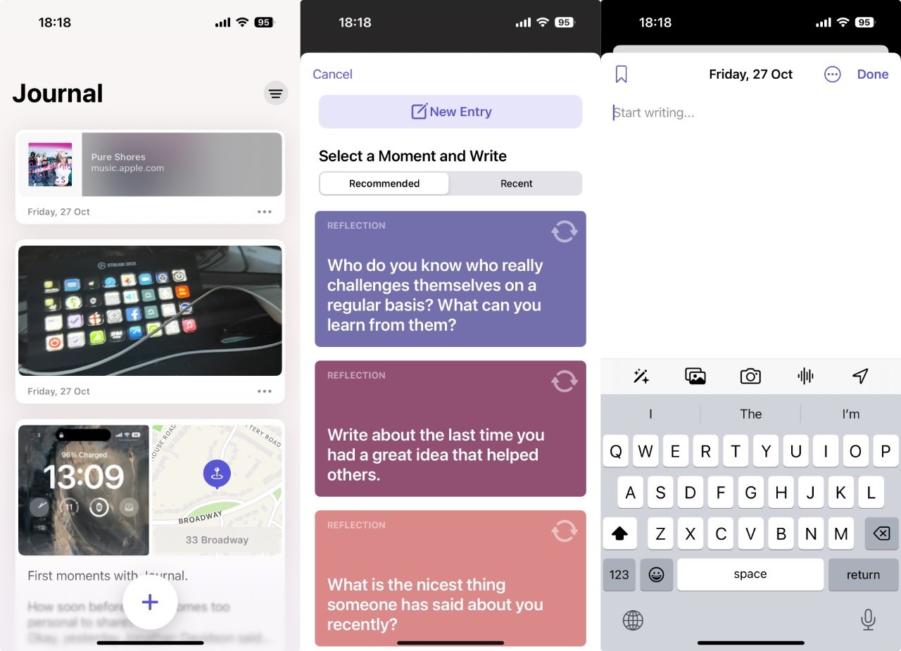
The Journal app released after a short beta period, but nothing seemed to change about how the app operated. It has a simple interface with a big plus symbol for adding entries, plus it introduces the Suggestions API.
It may be some time before Apple makes significant changes to how the Journal app operates. For now, it's good enough for general use and may attract users who've never journaled before.
What you get with Journal
If you've used an app like Day One, you know about writing a diary on your iPhone and how useful it can be to have that digitally. So alongside short notes or long essays, you can have photographs and weblinks.
And if you haven't used an app like Day One, Journal is going to try to convince you to have a go. It's likely to succeed, too.
For while Journal is just another app that you can write diary-like notes in, it's integrated deeply into iOS. Which means, should you choose, you can have it automatically include details of your day, specifically:
- Workouts and exercise activity
- Music and podcasts you played on your iPhone
- People you message or phone
- Photos
- Locations - both where you were today and where else you choose
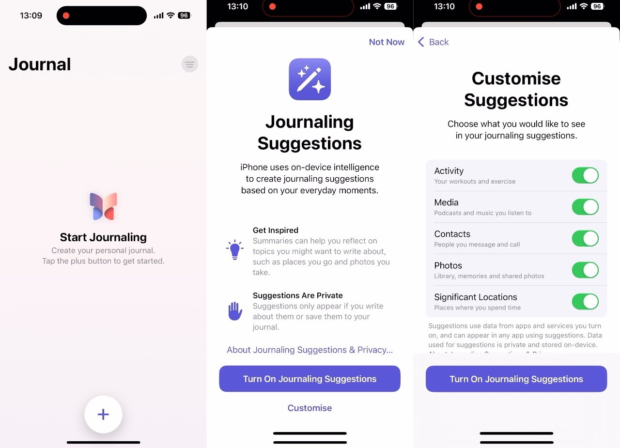
These are all called Journalling Suggestions. As well as being able to turn each one on or off, you have an overall button for turning them all on.
You can take suggestions or ignore them, but you still have to tap first the plus sign and then the New Entry buton
Problems with Journal
Or rather, you have this control when you first use Journal. Once you've tapped on Turn On Journaling Suggestions, good luck finding your way back to that control.
Apple wants you to have the absolute fewest distractions in Journal, so that you will write in it more often. So at present, after you've set it up the first time, Journal appears to forever hide those options away.
Instead, you are presented with only three things every time you open the app:
- Journal entries you've written
- A basic filter button
- A big Plus sign for starting a new entry
That filter button lets you see all entries, all that have photos, or all that have locations associated with them. At present, there's no way to search the Journal for every time you mention chocolate, for instance.
How to use Journal
- Open the app on your iPhone
- Tap the Plus sign
- Either tap on New Entry to begin, or
- Scroll through the suggested prompts under Recommended or Recent
- Then either start writing, or
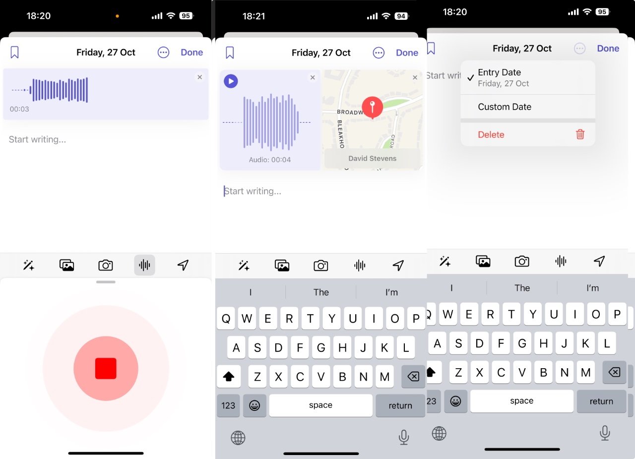
- Tap on one of the five controls above the keyboard
- Optionally, tap the ellipses button at top right
- When finished, tap Done
The five controls over the keyboard are ways that you can insert certain elements into the entry, such as photos. Anything you add from those gets saved in the new post and so does a copy of the Journaling Suggestion that prompted you.
There is a small close box on the suggestion so you can remove it from the post, though.
The Recent and Recommended sections offer options based on the available categories. The longer you use Journal and the more you do in a day, the more options that appear.
What you can do with Journal at present
You can, of course, add in photographs type the word "chocolate" into a Journal post as often as you like. Plus you can elect to add photos.
Interestingly, Journal has slightly different limitations over your photo library compared to other apps. Other apps will ask for permission and you get the choice to say they access everything, or just a specific set.
With Journal, it does ask permission, but it's subtly different. "Your photo library is shown here," says the app, "but 'Journal' can only access the items you select."
You can also take a new photo right now, or you can record an audio entry. Surprisingly, audio entries are not transcribed for you.
Then there's also a location button. Journal should note where you are when you write the entry, but you can also elect to add in other places.
Tied to this, Journal defaults to assuming your entry is for today, but it needn't be. You can set it to any date you like, and so if you're catching up on what you've done in the last week, you can also then choose the locations where you were during that time.
What you don't get with Journal
As well as the peculiar absence of controls, after you've first used them, there's also an odd thing about entering new Journal posts. You can almost exclusively only do it by opening the app — either yourself or when prompted by Journal — and tapping that Plus sign.
There's no adding to Journal through Siri, for instance. At present, if you try any combination of phrases to do with adding a journal entry, Siri creates an appointment in your calendar instead.
You can't use a widget to enter a Journal post. And there's no Shortcut action for it, so there's no way to have the Action button start a new entry.
There's no Control Center button for it, either. Nor is there a Messages app for Journal.
However, Journal is an entry under the Share option in apps such as Music and Photos. There's no way to Share a track or an image from those apps into a single Journal entry, though, they each get their own separate one.
These are all things that it's curious they haven't been included or aren't available, but also none of them are exactly wrong. It's not like the lack of a widget is a bug.
It's just that these are all very obvious areas for significant improvement, and it seems reasonable to assume that the missing features will be added at some point.
Yet Journal is good
These are all notable omissions, but perhaps they pale next to the biggest one. Journal is only on the iPhone, it is not coming to the iPad or the Mac — or at least, not until after WWDC 2024.
The Mac, above all else, would seem to be a perfect spot for it.
So it's limited to one device, and on that one device Journal is very limited in what you can do, and even more limited in your options for later customizing it.
Yet still, Journal is appealing. This lack of seemingly obvious features doesn't detract from how well done the app is in terms of making you want to write in it.
The Journal Suggestions are arguably a little cheesy at times. If you tap the suggestions button above the keyboard, you get three banners showing what is sometimes a very Hallmark-card like kind of sentiment.
For example, you can be prompted with "What is the nicest thing someone has said about you recently?" Or "Write about the last time you had a great idea that helped others."
The thing is, the prompts work. And if you don't like one, each of those three banners includes a Refresh button.
Tapping that gives you a new suggestion, and it's only from quite a limited pot, but it will get you writing something and that's the sole purpose of this app.
The first time you start Journal, you get many options — you just don't seem to ever be able to find them again
Where Journal succeeds
Journal does succeed, too. It may have puzzling omissions, but it being present on your iPhone is enough to make you want to use it, unless you hide it three folders and five screens away.
Even if you do that, Journal will prompt you to add to it. By default, it will send you a notification a few times a week, but a schedule can be set in the Settings app.
And if you have never used a journaling app because you explicitly don't want to, you don't have to.
Only, any journaling app is good and any journaling app gets better over time as you add more to it.
And Journal has a very clear benefit over all of its many third-party rivals, including Day One. It's from Apple, it's part of iOS, so you are not going to lose your data.
It's impossible to say that for absolute certain, of course, but if Apple were to lose your data, there would be a tonne of bricks falling down on the company. You know it has staff dedicated to protecting all of your data, whether it's in iCloud or only occasionally backed up.
This is a way of saying that Apple is too big to fail, or perhaps really that it's so big it daren't fail and will have taken extraordinary precautions to make sure it doesn't.
It only takes one loss of data to destroy your trust in a journaling app, and that has happened even with the most famous of them, Day One.
So Journal has Sherlocked Day One and the dozens of other journaling apps while offering an olive branch with the Suggestions API, but it's Sherlocked them well. Even with all of the seemingly missing features.


