For news and information junkies wanting to stay on top of the newest developments in their areas of obsessive interest, nothing beats a newsreader (also known as a news aggregator or RSS reader). Such an app lets users specify which Web sites they want to monitor and consolidates the continually updating RSS feeds from these sources in one place for convenient consumption.
For many Apple users, Reeder is the gold standard of newsreaders. Available for both iOS and macOS, Reeder makes news reading an elegant, enjoyable experience. Version 3 had been getting a bit long in the tooth, though, with problems such as a lack of support for the native screen resolutions of the newest iPad Pro models.
Happily, developer Silvio Rizzi has just released Reeder 4, and it’s available on the App Store and Mac App Store for $4.99 and $9.99, respectively. There are no upgrade discounts, as is the case for most apps sold through Apple’s App Stores. The iOS and Mac versions are all but identical in appearance and functionality, which isn’t coincidental: the rebuilt apps now share a codebase for easier and hopefully more frequent updates.
The Reeder Backstory
Before I dig into Reeder’s new features, let me share a bit of history.
Reeder has a long pedigree, going all the way back to 2011 when it served as a front end for the Web-based Google Reader. Google controversially killed Google Reader in 2013, but Reeder lived on, adapting to a fragmented RSS realm with an array of Web-based Google Reader replacements (see “Explore Alternatives to Google Reader,” 18 March 2013, and “The State of Google Reader Replacements,” 27 June 2013).
In this regard, Reeder found its groove as a sort of über-newsreader that could pull in not only individual site feeds, but aggregated feed data from other newsreaders—including the likes of Feedly, Feedbin, Feed Wrangler, FeedHQ and NewsBlur. Put another way, Reeder became a stylish, iOS- and Mac-native client for Web-based newsreaders.
Over time, Reeder has maintained its reputation as a minimalist tool for efficiently processing RSS feeds while optionally filtering out cacophony and garishness. It’s an extraordinarily attractive and nimble app with rich theming, a bevy of keyboard shortcuts, and an assortment of gestures for powering through the news using a Mac’s Magic Trackpad or an iOS device’s touch screen.
Reeder 4 Look and Feel
The new version of Reeder, longtime devotees will be thrilled to discover, is largely unchanged.
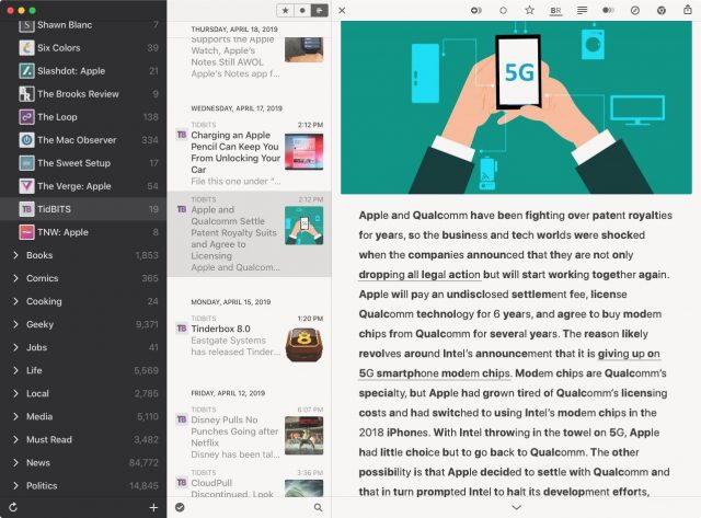
Navigation on iOS and the Mac is the same: it’s made up of columns. Moving from left to right, you have columns showing:
- Web-based reader accounts
- Feeds and feed groupings
- Article headlines
- The current article in a streamlined form
Clicking an article headline displays the corresponding full Web page while collapsing all but the headline column for more reading room. You can also choose to open an article in an external Web browser.
One aesthetic change is obvious: Reeder now displays article thumbnails in the headline column to serve as visual cues about article content. Previously, Reeder was notable for eschewing such interface flourishes, offering only favicons as visual clues about the article’s source. You can set the thumbnails to any of three sizes, or, for traditionalists, banish them from view. For more minimalism, you can switch the favicons from color to grayscale. Silvio Rizzi is clearly trying to keep everyone happy.
Reeder 4 has other, minor but welcome interface changes to enhance its usability—including options for larger, more readable text in the feed and headline columns. This is helpful for people reading on bigger screens and for those among us whose eyes aren’t getting any younger.
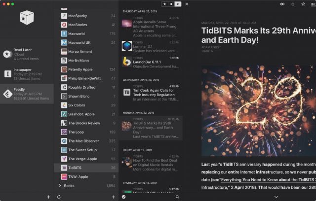
Theme selection has been simplified a bit, and now includes support for Mojave’s Dark mode, along with a totally black option designed for use on recent iPhones with OLED displays.
Other Reeder 4 Features
Reeder 4 sports several other new capabilities that are not groundbreaking but make the app more versatile and user-friendly.
Bionic Reading Mode
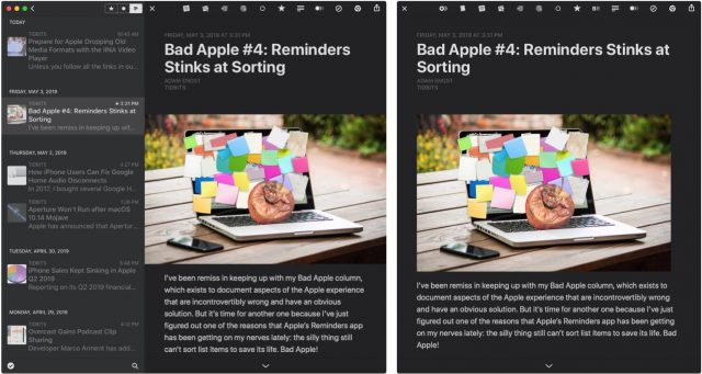
This option sets portions of words in bold to create text that is, at least for some, easier to scan and digest. The Bionic Reading technology did not originate with Reeder, and it’s also available as Chrome and Firefox extensions for in-browser reading. You can toggle Bionic Reading off and on using a toolbar button and alter its appearance using sliders (for tweaking “fixation” and “saccade,” whatever the heck those mean) in Reeder’s preferences.
 Read Later Support
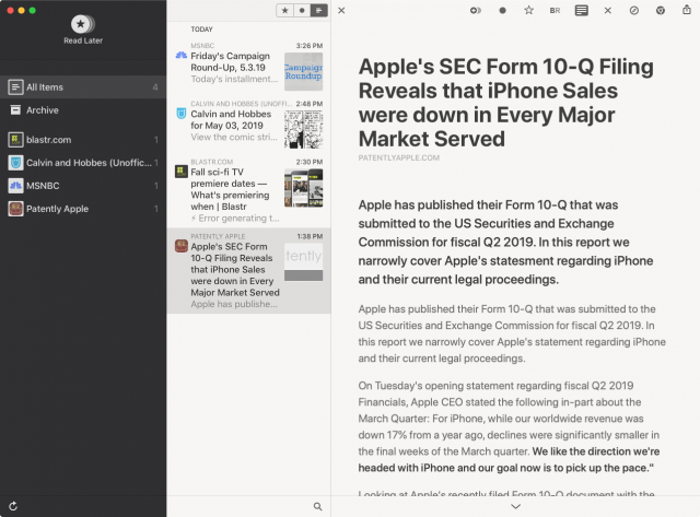
For those wanting to save articles for later reading, Reeder now sports a native Read Later mode that syncs via iCloud so you can access your archived articles in the Mac and iOS versions of the app. Once you’ve set up this mode as its own account, alongside your usual RSS services, you’re good to go.
Reeder also has you covered if you prefer the Instapaper read-later service or Safari’s Reading List feature. You can Control-click any article and choose either option (or Reeder’s own Read Later service) to save the article for later. Instapaper users also can move articles into folders they’ve created on the service without needing to leave Reeder, but the app makes this a bit confusing by calling the folders “tags.”
It’s a shame Reeder lacks native support for the popular Pocket read-later service, but you can still save stories to Pocket using the standard Mac or iOS share sheet. You just won’t have this content integrated into the Reeder app.
Automatic Layouts
Reeder 4 on Mac and iPad is deliciously malleable thanks to layout choices for screens of all sizes and proportions (on iPhone there’s only one layout). You can go from a “single” layout for just a list of stories to the “full” option with all interface elements on display, with a couple of other layout options in between.
Reeder 3 wasn’t as versatile, providing only “full” and “minimized” layouts.
Best of all, Reeder 4 has an automatic-layout mode. Select it, and the app will make all of the necessary layout adjustments on the fly depending on the size and shape of its window.
Improved Reader Mode
This one is a bit confusing, but it can be helpful once you understand what’s going on. Reeder 4 offers a Reader view, via a button in the toolbar, to clean up an article for easier reading. But since articles are already shown in cleaned-up form when you pick them in the list, you might wonder why you need to streamline an already streamlined article.
It turns out that the default article view in Reeder is based on how the corresponding RSS feed is set up. Sometimes that includes the full article text, but often it offers just a text snippet.
Reader view can be useful because it always retrieves the full article text while streamlining it for greater readability. Still, it’s sometimes a toss-up as to which of the two views (feed view or Reader Mode) is more readable and pleasing to the eye, so feel free to experiment.
You also, of course, always have the option to access the article’s fully formatted Web page, without any text simplifying, if that’s what you prefer.
Hey, Where’s the Share Sheet?
Along with additions and improvements, there’s one obvious subtraction. Reeder veterans will notice (and potentially lament) the loss of the app’s longtime native share sheet (as opposed to the standard macOS and iOS share sheets). I liked Silvio Rizzi’s custom share sheet, with a look and feel mirroring the rest of the app. Apple’s generic share sheets are a bit visually jarring given Reeder’s consistently minimalist style.
Reeder 4 for Mac still offers options for adding service icons to the toolbar along the top of the app’s window but, again, these don’t adhere to the developer’s style conventions and therefore look a bit out of place.
The Read on Reeder 4
Reeder 4 is a solid upgrade, though one that Reeder 3 users shouldn’t feel pressured to embrace. The old version will keep working for the foreseeable future, according to Rizzi. And, more generally, Reeder is not a necessity if you already like using one of the Web-based newsreader services. I also often use Feedly directly via its Web-based interface and iOS app—Feedly has come a long way since it first emerged as a notable Google Reader replacement.
But longtime Reeder users are likely to find version 4 enticing. Its marquee features aside—I don’t find Bionic Reading helpful, and as a Pocket user I’ll never use Reeder’s new Read Later functionality—the interface tweaks make the app easier and more pleasurable to use. Thumbnails in the headline column alone are worth the price of admission for those who like to identify article sources. And I think it’s worth spending a few bucks for a top-flight Mac or iOS app to get the best possible newsreader experience.


