December 10, 2019 2:00PM

Cloudflare aspires to make Internet properties everywhere faster, more secure, and more reliable. Load Balancing helps with speed and reliability and has been evolving over the past three years.
Let’s go through a scenario that highlights a bit more of what a Load Balancer is and the value it can provide. A standard load balancer comprises a set of pools, each of which have origin servers that are hostnames and/or IP addresses. A routing policy is assigned to each load balancer, which determines the origin pool selection process.
Let’s say you build an API that is using cloud provider ACME Web Services. Unfortunately, ACME had a rough week, and their service had a regional outage in their Eastern US region. Consequently, your website was unable to serve traffic during this period, which resulted in reduced brand trust from users and missed revenue. To prevent this from happening again, you decide to take two steps: use a secondary cloud provider (in order to avoid having ACME as a single point of failure) and use Cloudflare’s Load Balancing to take advantage of the multi-cloud architecture. Cloudflare’s Load Balancing can help you maximize your API’s availability for your new architecture. For example, you can assign health checks to each of your origin pools. These health checks can monitor your origin servers’ health by checking HTTP status codes, response bodies, and more. If an origin pool’s response doesn’t match what is expected, then traffic will stop being steered there. This will reduce downtime for your API when ACME has a regional outage because traffic in that region will seamlessly be rerouted to your fallback origin pool(s). In this scenario, you can set the fallback pool to be origin servers in your secondary cloud provider. In addition to health checks, you can use the ‘random’ routing policy in order to distribute your customers’ API requests evenly across your backend. If you want to optimize your response time instead, you can use ‘dynamic steering’, which will send traffic to the origin determined to be closest to your customer.
Our customers love Cloudflare Load Balancing, and we’re always looking to improve and make our customers’ lives easier. Since Cloudflare’s Load Balancing was first released, the most popular customer request was for an analytics service that would provide insights on traffic steering decisions.
Today, we are rolling out Load Balancing Analytics in the Traffic tab of the Cloudflare dashboard. The three major components in the analytics service are:
- An overview of traffic flow that can be filtered by load balancer, pool, origin, and region.
- A latency map that indicates origin health status and latency metrics from Cloudflare’s global network spanning 194 cities and growing!
- Event logs denoting changes in origin health. This feature was released in 2018 and tracks pool and origin transitions between healthy and unhealthy states. We’ve moved these logs under the new Load Balancing Analytics subtab. See the documentation to learn more.
In this blog post, we’ll discuss the traffic flow distribution and the latency map.
Traffic Flow Overview
Our users want a detailed view into where their traffic is going, why it is going there, and insights into what changes may optimize their infrastructure. With Load Balancing Analytics, users can graphically view traffic demands on load balancers, pools, and origins over variable time ranges.
Understanding how traffic flow is distributed informs the process of creating new origin pools, adapting to peak traffic demands, and observing failover response during origin pool failures.

In Figure 1, we can see an overview of traffic for a given domain. On Tuesday, the 24th, the red pool was created and added to the load balancer. In the following 36 hours, as the red pool handled more traffic, the blue and green pool both saw a reduced workload. In this scenario, the traffic distribution graph did provide the customer with new insights. First, it demonstrated that traffic was being steered to the new red pool. It also allowed the customer to understand the new level of traffic distribution across their network. Finally, it allowed the customer to confirm whether traffic decreased in the expected pools. Over time, these graphs can be used to better manage capacity and plan for upcoming infrastructure needs.
Latency Map
The traffic distribution overview is only one part of the puzzle. Another essential component is understanding request performance around the world. This is useful because customers can ensure user requests are handled as fast as possible, regardless of where in the world the request originates.
The standard Load Balancing configuration contains monitors that probe the health of customer origins. These monitors can be configured to run from a particular region(s) or, for Enterprise customers, from all Cloudflare locations. They collect useful information, such as round-trip time, that can be aggregated to create the latency map.
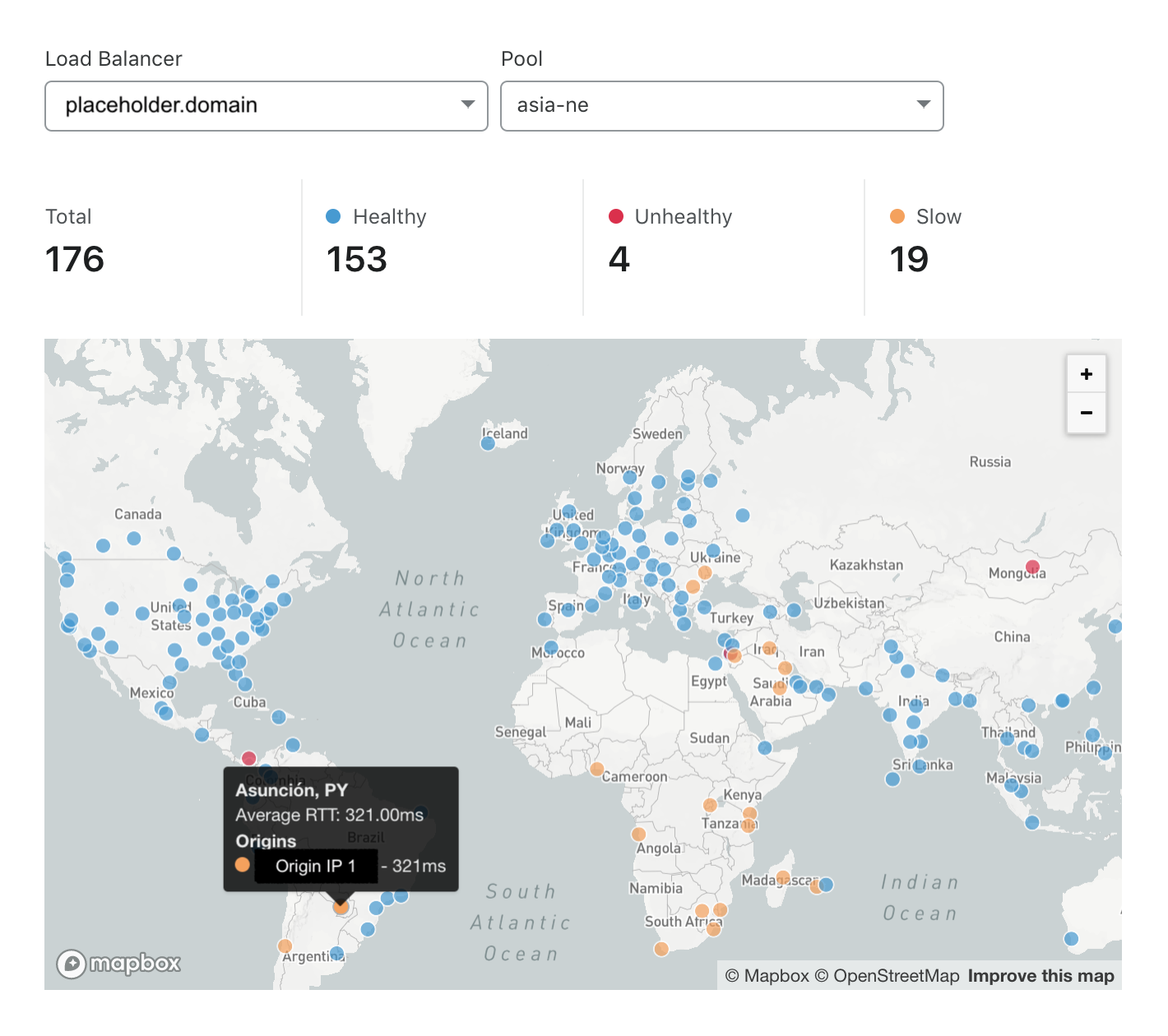
The map provides a summary of how responsive origins are from around the world, so customers can see regions where requests are underperforming and may need further investigation. A common metric used to identify performance is request latency. We found that the p90 latency for all Load Balancing origins being monitored is 300 milliseconds, which means that 90% of all monitors’ health checks had a round trip time faster than 300 milliseconds. We used this value to identify locations where latency was slower than the p90 latency seen by other Load Balancing customers.

In Figure 2, we can see the responsiveness of the Northeast Asia pool. The Northeast Asia pool is slow specifically for monitors in South America, the Middle East, and Southern Africa, but fast for monitors that are probing closer to the origin pool. Unfortunately, this means users for the pool in countries like Paraguay are seeing high request latency. High page load times have many unfortunate consequences: higher visitor bounce rate, decreased visitor satisfaction rate, and a lower search engine ranking. In order to avoid these repercussions, a site administrator could consider adding a new origin pool in a region closer to underserved regions. In Figure 3, we can see the result of adding a new origin pool in Eastern North America. We see the number of locations where the domain was found to be unhealthy drops to zero and the number of slow locations cut by more than 50%.

Tied with the traffic flow metrics from the Overview page, the latency map arms users with insights to optimize their internal systems, reduce their costs, and increase their application availability.
GraphQL Analytics API
Behind the scenes, Load Balancing Analytics is powered by the GraphQL Analytics API. As you’ll learn later this week, GraphQL provides many benefits to us at Cloudflare. Customers now only need to learn a single API format that will allow them to extract only the data they require. For internal development, GraphQL eliminates the need for customized analytics APIs for each service, reduces query cost by increasing cache hits, and reduces developer fatigue by using a straightforward query language with standardized input and output formats. Very soon, all Load Balancing customers on paid plans will be given the opportunity to extract insights from the GraphQL API. Let’s walk through some examples of how you can utilize the GraphQL API to understand your Load Balancing logs.
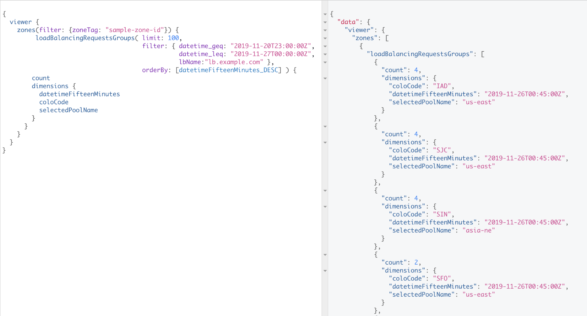
Suppose you want to understand the number of requests the pools for a load balancer are seeing from the different locations in Cloudflare’s global network. The query in Figure 4 counts the number of unique (location, pool ID) combinations every fifteen minutes over the course of a week.

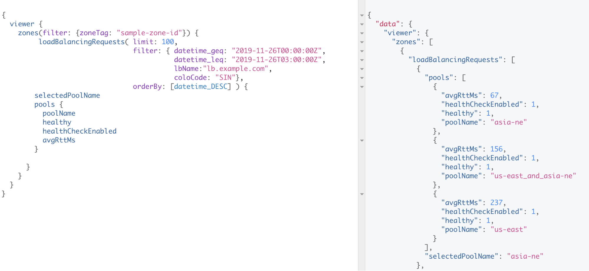
For context, our example load balancer, lb.example.com, utilizes dynamic steering. Dynamic steering directs requests to the most responsive, available, origin pool, which is often the closest. It does so using a weighted round-trip time measurement. Let’s try to understand why all traffic from Singapore (SIN) is being steered to our pool in Northeast Asia (asia-ne). We can run the query in Figure 5. This query shows us that the asia-ne pool has an avgRttMs value of 67ms, whereas the other two pools have avgRttMs values that exceed 150ms. The lower avgRttMs value explains why traffic in Singapore is being routed to the asia-ne pool.

Notice how the query in Figure 4 uses the loadBalancingRequestsGroups schema, whereas the query in Figure 5 uses the loadBalancingRequests schema. loadBalancingRequestsGroups queries aggregate data over the requested query interval, whereas loadBalancingRequests provides granular information on individual requests. For those ready to get started, Cloudflare has written a helpful guide. The GraphQL website is also a great resource. We recommend you use an IDE like GraphiQL to make your queries. GraphiQL embeds the schema documentation into the IDE, autocompletes, saves your queries, and manages your custom headers, all of which help make the developer experience smoother.
Conclusion
Now that the Load Balancing Analytics solution is live and available to all Pro, Business, Enterprise customers, we’re excited for you to start using it! We’ve attached a survey to the Traffic overview page, and we’d love to hear your feedback.


