Nine months ago, I set out to invent a new way of interfacing with our devices, armed with only a single metaphor: Mercury.
Mercury, the elemental manifestation of fluid chrome.
Mercury, the Roman deity bridging the boundary between two worlds.
Mercury, the nearest planet to the sun.
Although these versions of Mercury had little to do with interaction design, they perfectly summarized how I wanted the experience of computation to feel. I wanted the experience to feel fluid. I wanted to create something that users could move through without friction or boundaries. I wanted to bring people closer to their North Stars with speed and elegance.
In the months that followed, I devoured countless volumes of HCI literature while pivoting from one prototype to the next. I tried everything from a “smart-fidget-ring” concept that doubled as a universal remote, to wondering if something as simple as a rubber-band could serve as an interface. Although I was surprised that something so illogical could inspire so many avenues for exploration, nothing seemed to capture the feeling I had described in my poetic manifesto.

My breakthrough came when I realized that I had been asking all the wrong questions. I had spent months trying to invent new ways to navigate existing systems — but what if those systems were fundamentally flawed? What if the experience of Mercury required a radical re-invention of everything I had been taking for granted?
In my article titled “The Desktop Metaphor Must Die,” I described some fundamental issues with the Desktop metaphor and App Sandboxes. My personal investment in the future of computation goes much deeper than simply craving a better experience for experience’s sake.
Mercury is designed, first and foremost, to be an experience inclusive of people with limited executive function and cognitive load. People living with ASD, ADHD, and other neurological differences who are frequently overwhelmed by the flood of sensory information we have all come to expect in conventional operating systems.
People like me.

Research has shown that people with limited executive function find it more difficult to get things done when they are not in flow-state. We are also more susceptible to interruptions and interstitial friction. These interruptions include everything from the obvious (Notifications, Alerts, etc) to the not-so-obvious (Photoshop asking you to name your file AND choose where it will be saved). It is truly unfortunate that friction has come to be accepted as an unavoidable part of everyday computing.
For people who already have trouble controlling their locus of attention, the context switching required to deal with these interruptions can be an incredibly draining experience that could take up to 15 minutes. For comparison’s sake, the average neurotypical person is usually able to switch gears in under 10 seconds.
This is why the inherent modality of Applications and Windowing environments is particularly frustrating to me. And while I understand that for some people, the desktop metaphor is not broken enough to require any fixing (where’s the data?, they ask), I stand by my words and my truth.

On that note, let’s dive into what Mercury actually is.
1. Fluid
Instead of asking people to modify their thoughts and actions around the arbitrary sandboxes of Apps, Mercury responds fluidly to the intentions of its user, alleviating the risk of interstitial friction that all multi-tool workflows carry.
2. Focused
The clutter we take for granted in today’s operating systems can be overwhelming, especially for folks sensitive to stimulation. Mercury is respectful of limited bandwidths and attention spans, and rejects the idea of “notification driven engagement.” Information will not be pushed to the user unless they intentionally ask for it. Mercury’s intention-as-context architecture vaccinates the user against the unintentional consumption of information.
3. Familiar
Mercury introduces new ideas and metaphors through familiar interaction patterns on an existing device: Mercury is designed for multi-touch tablets with keyboard support — a category often overlooked as awkward hybrids straddling two worlds. Mercury leans into the playfulness afforded by multi-touch and the efficiency made possible by the keyboard.
Mercury re-imagines the operating system as a fluid experience driven by human intent.


On the atomic level, Mercury is comprised of Modules. Modules are combinations of content and actions assembled based on user intent.

Users can create new modules that live adjacent to the starting module. A horizontal row of Modules is called a Flow. This is true even if there is only one module in the entire row.

A Space is a contextual grouping of the different flows required to fulfill an overarching intent. For example, if a user declares a “Review Inbox” space, Mercury will populate it automatically with flows containing the unread messages that the user will need to read in order to fulfill their intention of reviewing their Inbox.

A Space is generated every time a user declares an intention from the empty state, and is generally named after said intention. Almost every interaction in Mercury takes place within a Space.

Modules are the building blocks of Mercury. They are defined using combinations of nouns (items), verbs (actions) and modifiers.
Modules generated by the system employ a Noun-Verb construction because it is assumed that the content of the module will dictate the actions the user will intend to take (if any).

User-defined Modules can certainly follow the Noun-Verb model described above. However, Verb-Noun construction is also supported so that users can ask for Modules colloquially. This use case will be especially common when Voice input is used.

Note that Mercury will not produce a Module from a definition that does not specify a Noun (e.g. “Play…”). Instead, it will suggest different nouns to complete the definition.
The Power of Locus
Users can redefine Modules at any time using its Locus (the action bar). Locus combines the power of a Command-Line Interface with the convenience of Natural Language Processing and the discoverability of GUI.
Locus recognizes complete sentences as Actions, and can even perform tasks that involve multiple steps. Just activate the Locus by tapping on it, or by toggling the Command key. As you type, Locus will offer context-specific suggestions to help you discover its capabilities.

Standardized Shortcuts
In conventional operating systems, keyboard shortcuts are hard to remember and a nuisance to find. Furthermore, different Apps may require different shortcuts for the same function.
In Mercury, shortcuts are standardized through Locus. To see which ones are available, simply press and hold the Command key. Without letting go of Command, start typing to progressively filter the list of actions down to the one you want.

Responsive Modules
Contextual modifiers (like conditional statements) can help automate more nuanced tasks on demand, without the need to leave the current context.

Simultaneous Modules
Modules are able to exist in multiple Flows and Spaces simultaneously if the user chooses to create Mirrors. Mirroring is fundamental to the architecture of Mercury, as it ensures that all items and actions are immediately reachable regardless of what Space (or context) the user is currently in. For example, mirrors of an email from your professor can exist in your Inbox Space and your Coursework Space at the same time.
In conventional App-driven operating systems, functions are segregated within different Apps. The process of moving from App to App generates friction that takes you out of flow, and distracts you from your intentions.
Mercury is designed to help you enter and stay in flow. If you want to perform an action while leaving your current module untouched, you can generate a new module by tapping the Plus bubble adjacent to your current module, or by pressing the Tab key on your keyboard.

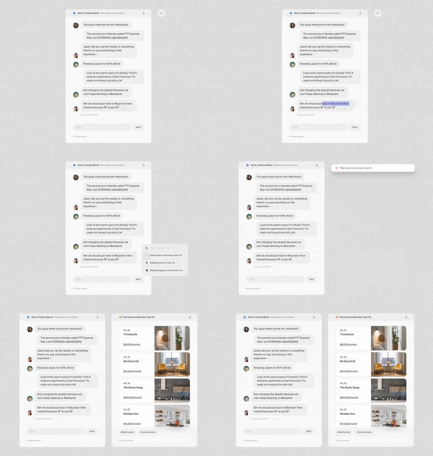
You can also use continuous gestural input to generate Modules without diverting your attention from the content you’re engaged in. Simply highlight a chunk of text to get started. An empty Module containing contextual suggestions will greet you where your finger left off so that you can keep the momentum going.

Everything you do in Mercury is organized within Spaces. Spaces can be created from scratch, built on top of a Blueprint (template Spaces for common contexts and workflows), or generated for you by Mercury.
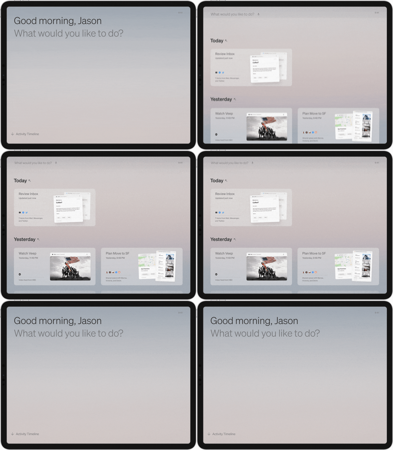
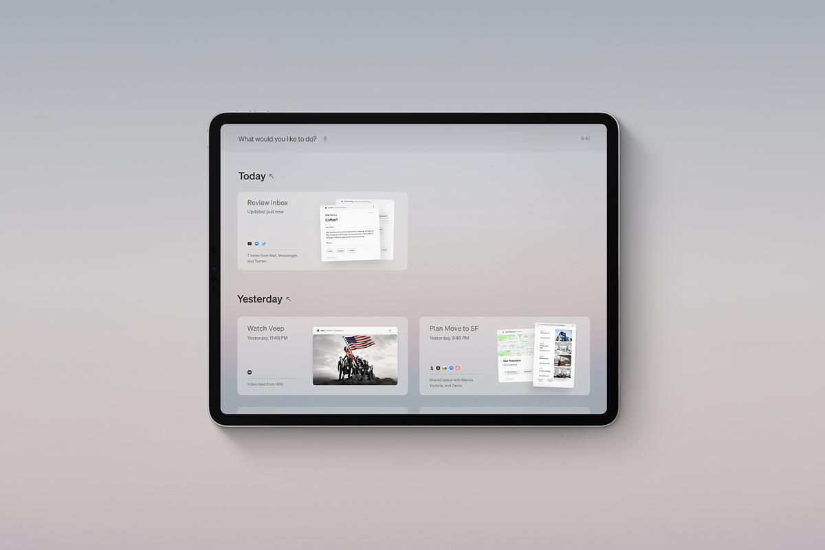
A swipe up from the home screen reveals your chronological journey through time and, ahem, Space. Can’t remember what you worked on last Thursday? Just find it in the Timeline. Want to reflect on the amount of time you spent Tweeting about Game of Thrones this weekend? To the Timeline we go.

Entering a Space from the Timeline feels like zooming into a different dimension. The interface fades into the distance so you can focus on getting into flow. While inside a Space, you will receive no notifications unless you intentionally specify your availability in the Rules of the Space. Nothing stands in between you and your intentions.

Within a Space, flows represent the necessary steps that need to be taken in order to accomplish the intention of the Space. The “Review Inbox” intention, for example, includes all unread mail messages as well as incoming direct messages aggregated from different, unrelated services. In a conventional OS, one would have had to open multiple browser tabs or Applications in order to accomplish the same intention of “Review Inbox.”
By isolating services from their wider ecosystems, Mercury helps prevent potential avenues for distraction and unintentional content consumption.

Your Space, Your Rules
The pinch gesture reveals a birds-eye view of every module inside the space, as well as the rules and collaborators that define how the space is generated.


Artificial Collaborators
In a speculative future without Apps, corporations can continue to offer services through AI assistants. Adding these assistants into a spaces will add service-specific funtionality to the Modules in that space. For example, you may enlist the help of several Virtual Shopping Assistants on your quest to find the perfect pair of kicks.

You can ask Collaborators to generate modules automatically, or restrict their activity based on context. Collaborators will not have access to any information outside of the modules directly affected by their input. The sandboxing of Collaborators within Spaces protects your privacy while preserving intentional access to services you may rely on.
Get Together
Plan a trip to Vegas. Watch BLACKPINK’s comeback with your fandom. Share documents, images, and work collaboratively in real time by inviting others to join one of your Spaces.

Mercury’s visual identity fuses the rational structures of Western Modernist design with the East Asian instinct to seek tranquility in chaos.
Fog
Kiri (霧), Japanese for “fog,” is the name of Mercury’s visual manifestation. Kiri takes a judicious approach to contrast — bringing clarity only where it is needed, while obfuscating extraneous noise under a soft mist.
Choreography
Motion is used throughout Mercury to maintain spatial consistency and to guide the user’s locus of attention from one module to the next. Mercury’s choreography was inspired by the Daoist Way of inexertion; the interface moves without resistance to human input before easing into the equilibrium of stillness.
Typography
Mercury emphasizes contrast in type size to reinforce information hierarchy and spatial consistency. The world of Mercury is set exclusively in Söhne by Klim Type Foundry, a type family exuding elegance and softness, while remaining uncompromising on clarity.
Where there’s light…
Kiri retreats into the shadows when night falls. Modules are backlit with a sublime incandesence inspired by the ethereal glow of moonlight.

The one thing that has become blindingly clear to me throughout this nine month process is how absurdly foolish I was in believing I could go about doing this alone. This particular line of inquiry is so ambiguous, so reliant on abstract ideas and metaphors that I found myself digging rabbit holes for weeks and weeks only to lose my way in their murky depths.
In fact, almost all of the defining moments of Mercury have been a product of inviting the brilliance of others into my isolation chamber for feedback or collaboration. The feeling of bouncing ideas off exponential collaborators and working towards a shared North Star is addictive; all I can think about is how much I want to do this for the rest of my life.
And that is exactly what I intend to do.
I will be graduating from my BFA program at RISD in under a week, and my current plan is to travel to the West Coast in search of exponential collaborators and cybernetic thinkers who are also passionate about exploring this domaine. And if I can’t find a team, I intend on building one.
There are so many questions I still need to answer, so many ambiguities I need to explore, and so many loopholes I need to reexamine. Universal undo/redo is so needed, yet strangely absent in almost all operating systems today (Shake to undo is not a viable replacement).

And what about screens as a whole? Is the future of computation really just sliding fingers around slabs of glass?
Instead of trying to resist the crushing gravity of curiosity, I am choosing to commit myself to a life time of cybernetic thinking, question-asking, and trouble-making. Hopefully, I won’t be alone.
So, what’s next? I have no clue.
All I know is that I must keep going.
Your’s truly,
Jason Yuan
Humane Interface Designer and Advocate
Creator of Mercury OS
Mercury would not have been possible without the generous feedback and encouragement from my wonderful peers, mentors, and friends.
My most heartfelt thank you’s to Danny Trinh, Phill Ryu, Thomas Buffet, Mark Laughlin, Dandan Luo, Katie McIntyre, Jonathan Lee, Bob Burrough, Ed Kim, Marc Reisen, Ja Yoon Lee, Advait Kalakkad, Evan Rodgers, Gabby Widjaja, Cameron Burgess, Sharon Wei, Laurent Del Rey, Newar Choukeir, Victoria Wang, Aiden Fisher, Alex Schneidman, Devin Fan, Mac Wang, Eliza Chen, Sumaia Masoom, Theia Flynn, James Goggin, Sofia Soto, Evelyn Ma, Jennifer Joung, Vivian Wang, Lucas Ochoa, Kristina Selinski, SueSan Chen, and Gray Crawford.
Special thanks to:
Marisa Lu for bringing brilliance to the darkest tunnels of this journey,
Jodi Leo for keeping me afloat and for making the world feel less alone,
Paul Soulellis for your guidance and unwavering faith,
Lindsey Weiss for your profound insights and for siblinghood,
Kris Sowersby for trusting me with bringing your characters to life.
Pam Daniels and Brandon Williams for introducing me to the world of design,
David Catlin and TBD for the gift of storytelling and the strength to speak up,
And to Dennis Jin for being the epitome of an exponential collaborator.
For helping shoulder the weight of Mercury, for your technical expertise, and for all the hours you poured into this. Truly incredible.
And thank you, dear reader, for participating in this conversation and for making it this far. Thank you for your curiosity.
