The design community has started to apply some rigor toward documenting and systematizing components in both design and code, but motion is often left out of the discussion. However, the requirements of using motion in design falls perfectly in line with the guidelines of a design system: repeatability, time savings, and UX consistencies.
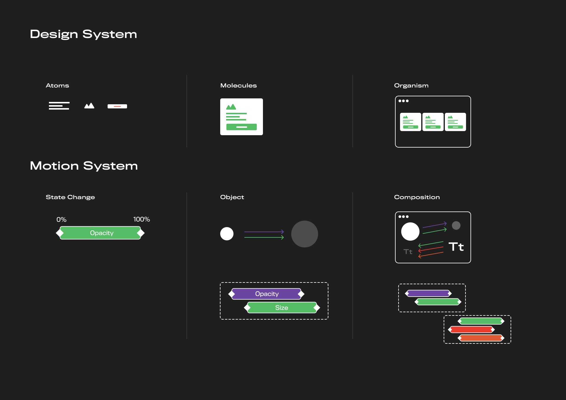
By excluding motion from your design system, you potentially weaken its purpose. If designers have the necessary building blocks for everything else but motion, they’ll have no choice but to create ad-hoc pieces that may not fit the rules and style guide that make up the design system. Additionally, you rob your team, product, and ultimately your users, of the benefits of a deeper design dimension. Motion in design doesn’t just look cool, it directly contributes to the user experience in these ways:
- Delight users: Motion can turn a vanilla experience into a memorable interaction.
- Educate users: Motion can provide context and information without requiring action such as additional clicks.
- Focus users: Motion can capture attention and highlight an important piece of data or key UI element.
In the above example, an entrance motion (left) educates the user on the direction of navigation, i.e. scroll left and right. The focus animation (center) draws attention to new content and teaches users the ephemeral nature of the content. The delight animation (right) reinforces the playfulness of the brand with a looping character animation.
The benefits of motion are too compelling to ignore. To add motion to your design system, follow these steps:
Step 1 - Start With an Audit
Before you create anything new, take a look at what currently exists. In the same way that you conduct an audit of your UI patterns, you can do the same for motion patterns.
This can be time-consuming, but it will show you where you have repeated uses of the same element, which should be added to the design system, and one-off uses that likely don’t provide universal solutions.
When you start your audit, notice patterns like:
- Timing curves
- Types of usage (express, focus, inform)
- Choreography patterns (# of objects in motion)
- Effect Patterns (Scale, Opacity, Elevation, etc)
- Flows where motion is missing
- Flows where motion is too heavy
The audit can be as simple as a table view of patterns:
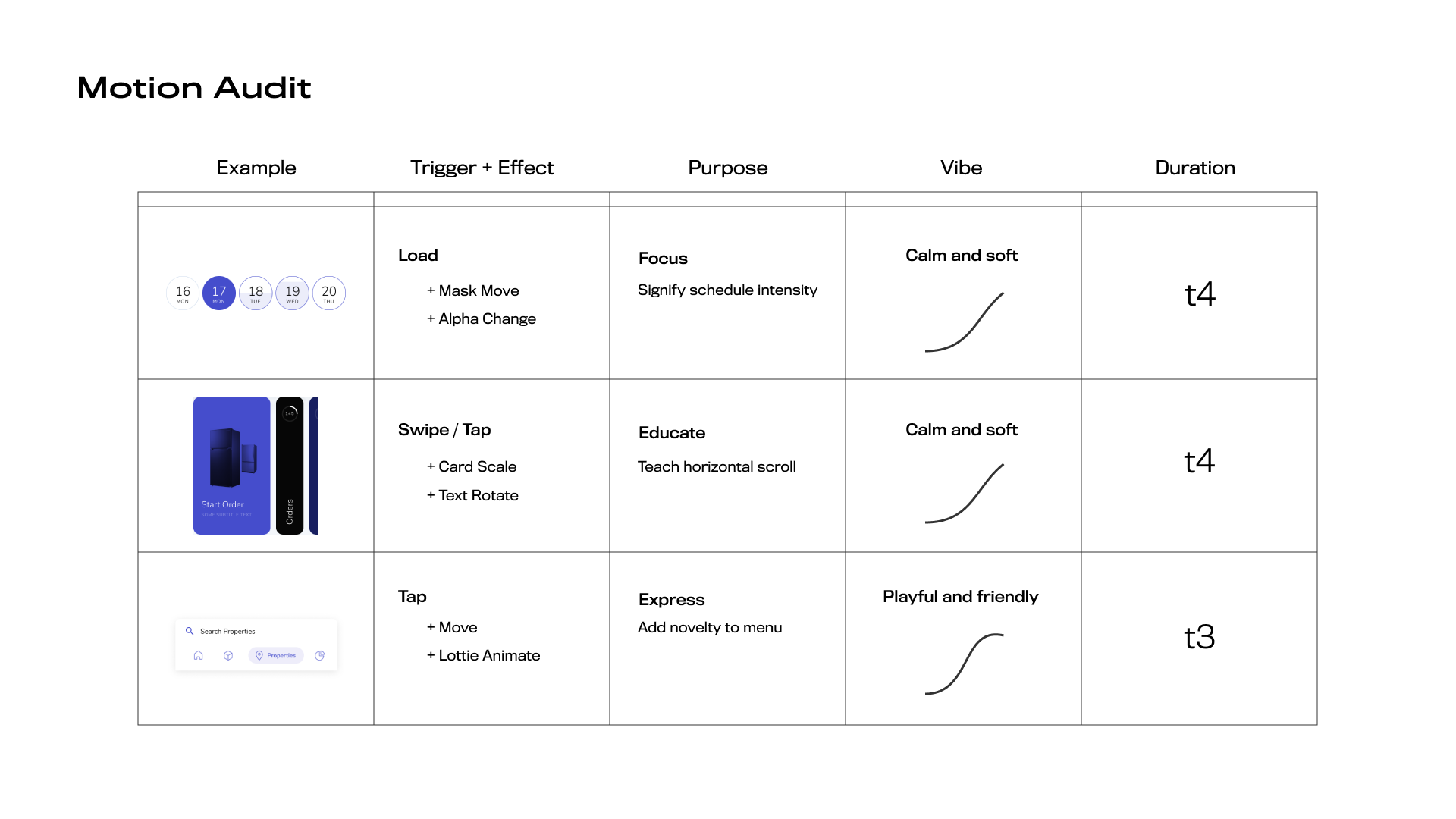
Much like you would run an audit to reduce the number of typefaces or font sizes you’re using, you want to employ a similar strategy with motion. By focusing on consistency across your motion system, you can create an environment that feels comfortable and predictable for the user.
Step 2 - Create Guiding Principles
Ambiguous usage principles for when and how to use motion can seriously threaten product consistency. Conversely, being overly prescriptive can stifle innovation and paralyze new patterns from emerging.
To find the right balance, consider principles that contextually guide UX enhancements: Where do we need stronger affordances & action feedback? Where is there fall off during onboarding? Or, where are users disorientated in our navigation?
Here are some of the most effective motion principles that scaling teams have used to implement motion into their systems:
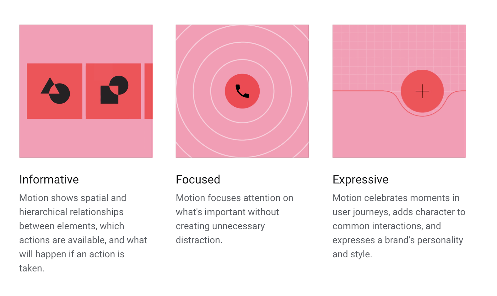
In an attempt to standardize, Material Design defined three principles for motion: informative, focused, and expressive. The team then determined four uses for each of the three principles: hierarchy, feedback, status, and character animation.
IBM suggests that motion can be described as expressive or productive. These two primarily relate to open / close states (like toggles or modals) but can be used in other instances where a quick movement is more reliable than a fancy expressive movement.
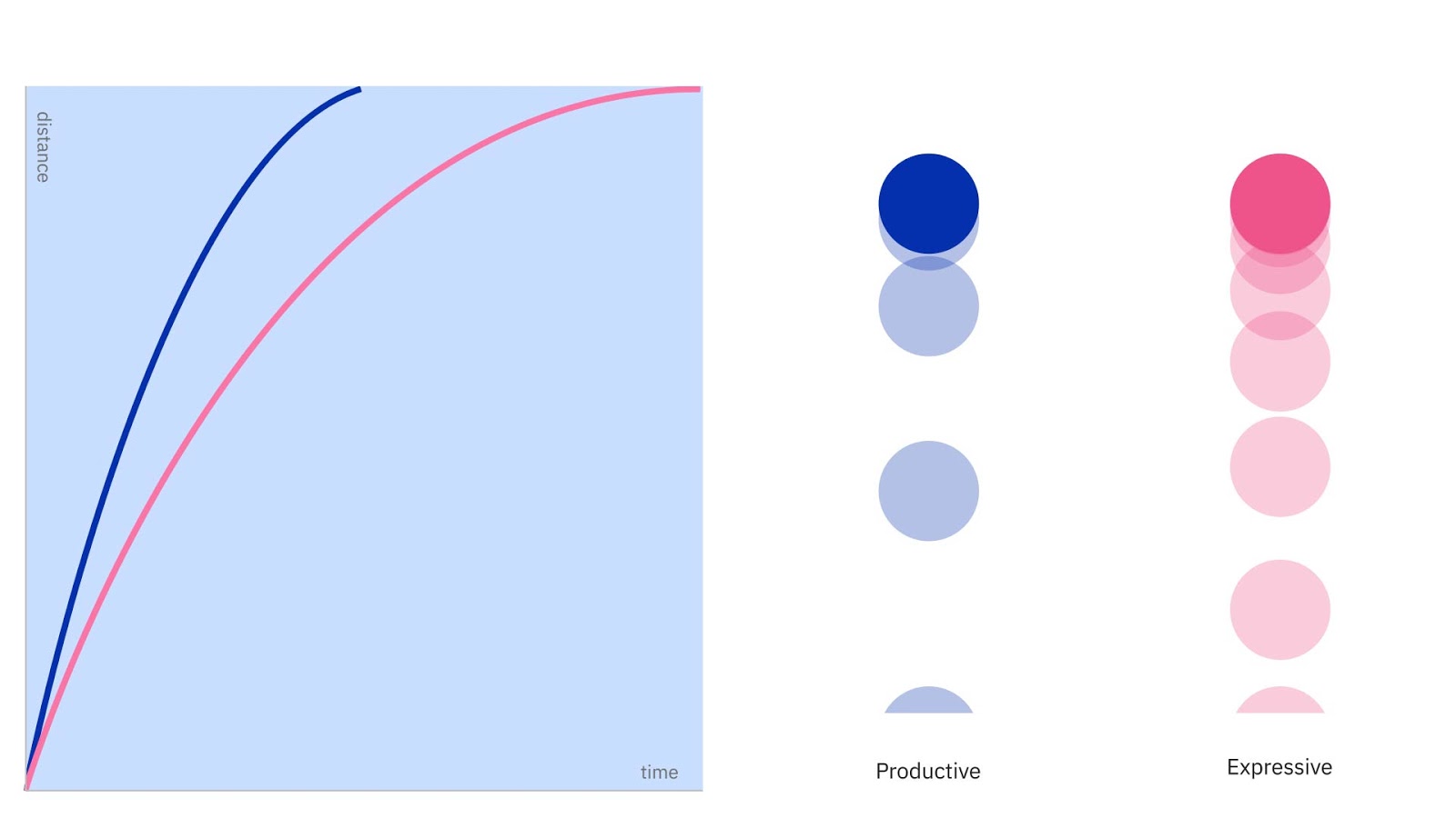
Salesforce follows a similar pattern by creating a bucket just for “Personality & Branding.” Instead of integrating brand personality into every animation’s timing and ease, they let their branded motion be contextual.

From these examples, we see that principles ultimately fall under two approaches: motion as delight and motion as usability. It’s up to teams to find the level of granularity that isn’t too narrow nor too wide. The right guiding principles will empower teams to be both creative and consistent.
Step 3 - Develop Building Blocks
Motion’s foundational makeup is concerned with the relationship between object, time, and effect. With principles established, teams can begin the process of defining the library of motion building blocks.
These blocks consist of duration, ease, object effects (start / end states), and the elegant dance of choreography (multiple objects animating).
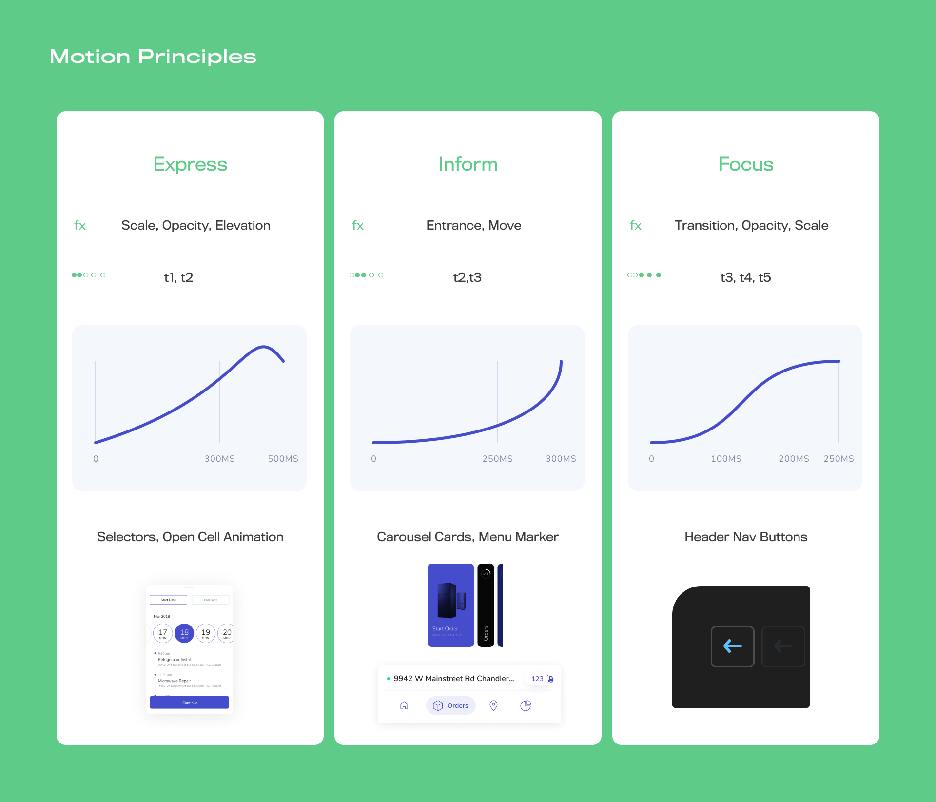
Duration (Timing Scales)
The concept of scales (or steps) in design systems allows for diversity of choice within bounds. We see this in typography, grids, and even color. These scales allow design-based decisions to happen quicker and more consistently.
You can use a similar scale framework to guide your motion library.
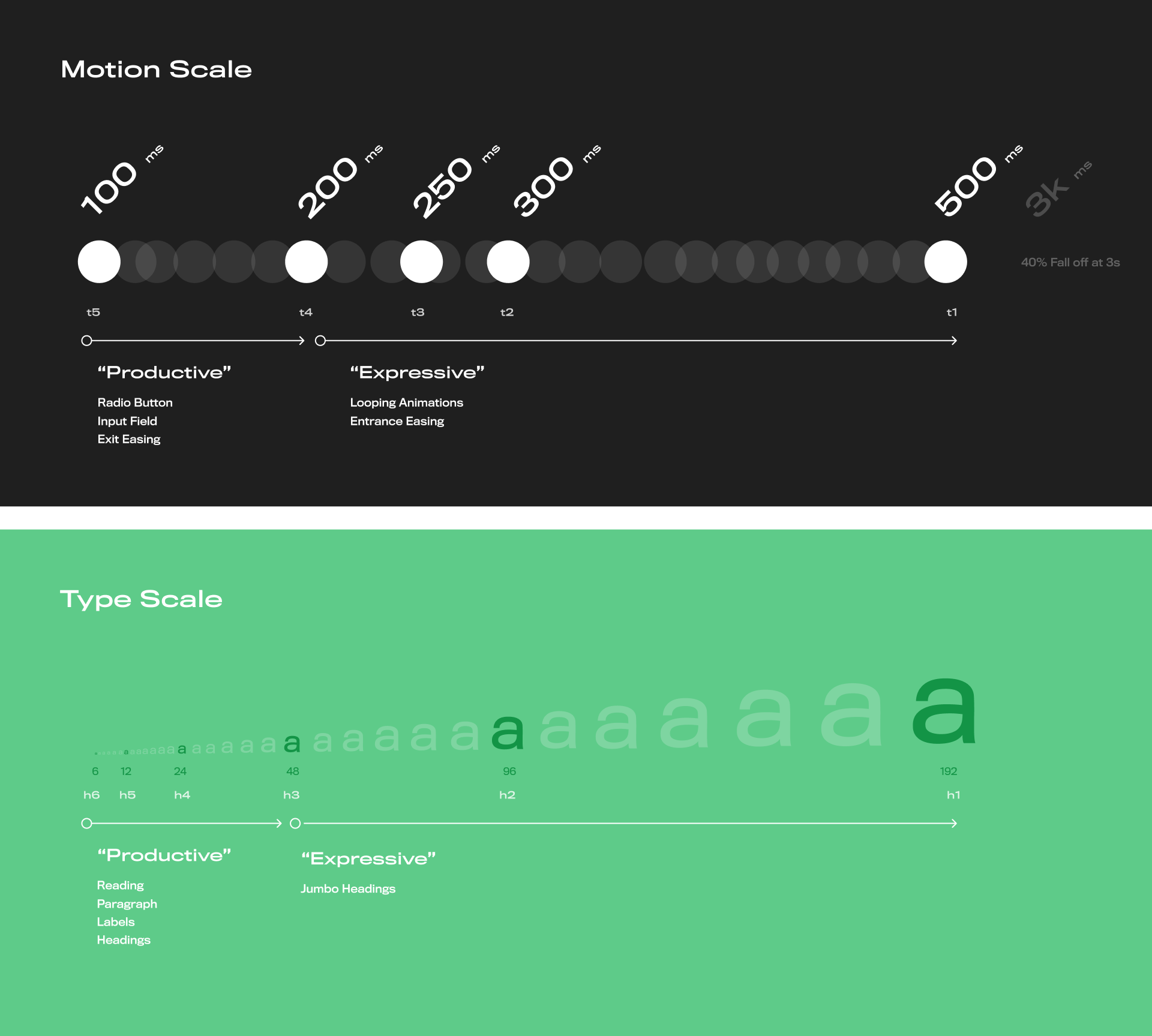
Much like you assign typography with h1, h2, h3, h4, h5 tags, you can assign tags to these scales: t1, t2, t3, t4, t5 (t for timing). You could also choose descriptive names such as: Extra Fast, Fast, Normal, Slow, Extra Slow, etc. Timing scales can include both duration and ease. However, most often, duration and easing will depend on the object, the object’s size, and the distance traveled.
Dynamic duration describes the relationship of an object’s size and distance weighted against time. For example, when you are defining motion scales, notice how quick movements are best suited for shorter distances and smaller objects.
Try creating a formula for dynamic duration that includes component, distance traveled, time, ease or even animation complexity. Consider these different approaches:
- Object based:
buttons / small components= 100MS - 200MS,Page Transitions= 500MS - 700MS - Size and distance: Movement is 100MS for every 10% movement of viewport
- Complexity of animation: Transitions where a sequence of 2-5 objects animation = 300-400MS; where 6-10 objects animate = 500-700MS
Easing
Easing adds life to motion by providing natural rests, and custom acceleration and deceleration. It can deepen your brand personality to the point that some teams even include “brand vibe” as a guiding principle.
There are numerous ways to create a “vibe” in motion by manipulating ease controls and duration, ranging from playful springy to soft subtle movements. For example, in an invoicing tool for lawyers you may want balanced and quick movements. Whereas, for a social video app you may want elastic and springy movements.
Consistent motion vibes can be as easy as documenting 2 to 3 types of ease bezier curves: default-ease (custom), ease-in, and ease-out.
In calling out an ease type, you can either name it after duration like 'T1-subtle-spring' or you can integrate ease into your timing scales: 't1 uses cubic-ease', 't2 uses linear ease'.
Another strategy is to base ease off of components, or their “in / out” states. For example, you might use Productive Easing for functional, quick, linear movements and use Expressive Easing for delightful, emotion-driven movements.
It’s often the case where expressive timing makes the most sense for “animate-in” and productive timing for “animate-out.” Modal pop-ups, toggle switches, cards, and transitions often use both expressive and productive timing.
Effects
Effects are the foundational building blocks of your system. They distinguish a component from being static. When effects are applied to components, they become an interactive system with a start and end state.
To systematize these effects, you can use a naming convention that describes them in bundles, or one that describes them as animate-in and animate-out states.
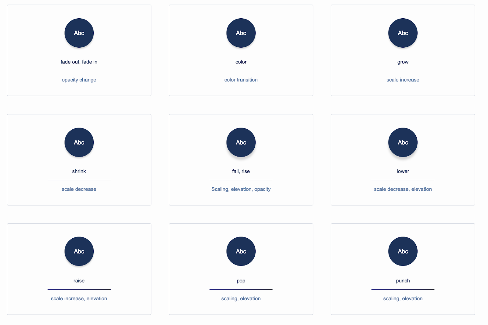
As you are documenting these effects,use descriptive names like “Card-Fade-In” or “Card-Grow,” or a more funky naming convention using onomatopoeia. When using onomatopoeia, an expressive page transition could be called pop, swoosh, or boom (Check out Keynote slide transitions or After Effect’s effect panel for naming ideas).
Choreography
Choreography is when multiple objects are simultaneously in motion during a transition. Choreography can focus a user during a transitional state, provide spatial context, or give personality and delight.
Here are a few different approaches to systematizing these patterns, but you should find what works best for your product:
- Complex & simple: A small number of objects in motion might be container based, meaning the content blocks inside the container move based on the container.
- Principle-based: Focus users on an object to show navigation context, or show spatial context, such as where to find a button.
- Narrative: At different stages of the user journey, make choreography more complex: new user sees 2-3 objects in motion and while a power user sees 4-8 objects
- Accessibility: Offer settings to reduce motion intensity or keep motion to containers instead of elements.
Step 4 - Preparing Translation Specs
For the sake of adoption, designers need to translate presentation files to match production code. The easiest way to document motion is to map out the start and end states. This is the premise of key-framing—to interpolate changes between state A and state B.
A storyboard, sketch, or MP4 video can often give developers all they need to build a prototype. But in order to scale motion systems, it’s critical to include translation.
There are two effective techniques to document motion concepts: diagrams and text.
Technique 1: Diagram Specs
Using whatever software you prefer, you can typically open a settings panel and screenshot or manually document a diagram chart (much like a Gantt chart).
Charts help depict choreography and duration in a clear way.
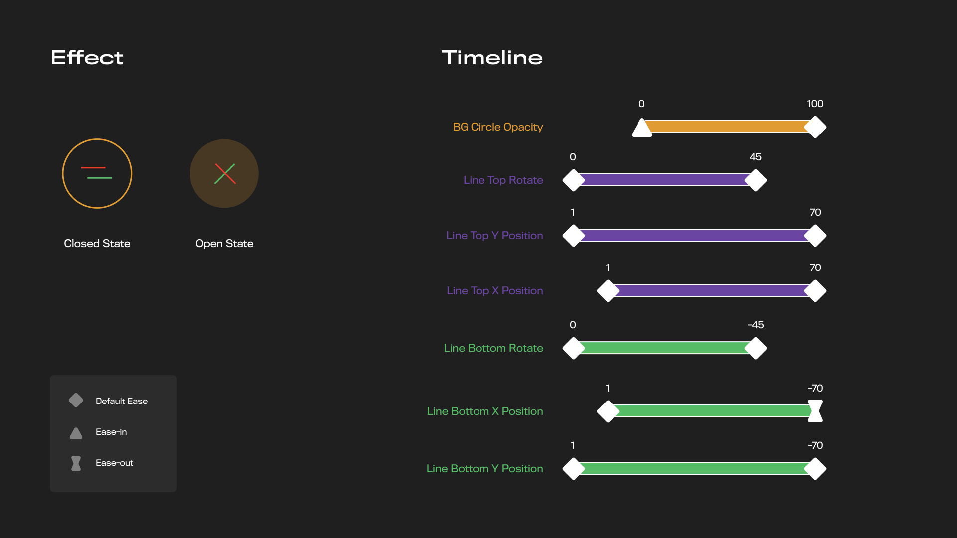
The diagram above shows duration (MS) and the overlap of animation sequences, as well as:
- Color: Object (color coordinate the effect with the timeline)
- Labels: Transformation Type (scale, move, rotate, etc), Duration (MS), object name
- Shapes (start / end): Easing type
Technique 2: Text Specs
This second approach is similar to code, but designers don’t have to fear talking code. It can be as simple as learning:
- Opacity: defined in percentages: 0% - 100%
- Scale: Defined in units or percentages: 1px, 2000px, 0 - 100%
- Elevation: Z-axis: 0, 1, 2, etc
- Move: x and y coordinates (could also be % of screen width and height)
- Color: HEX values
The benefit of this approach is that text is easily editable and these data points can more easily be translated into production code.
In After Effects, there’s a plugin called Inspector Spacetime that translates keyframe properties into a text file.
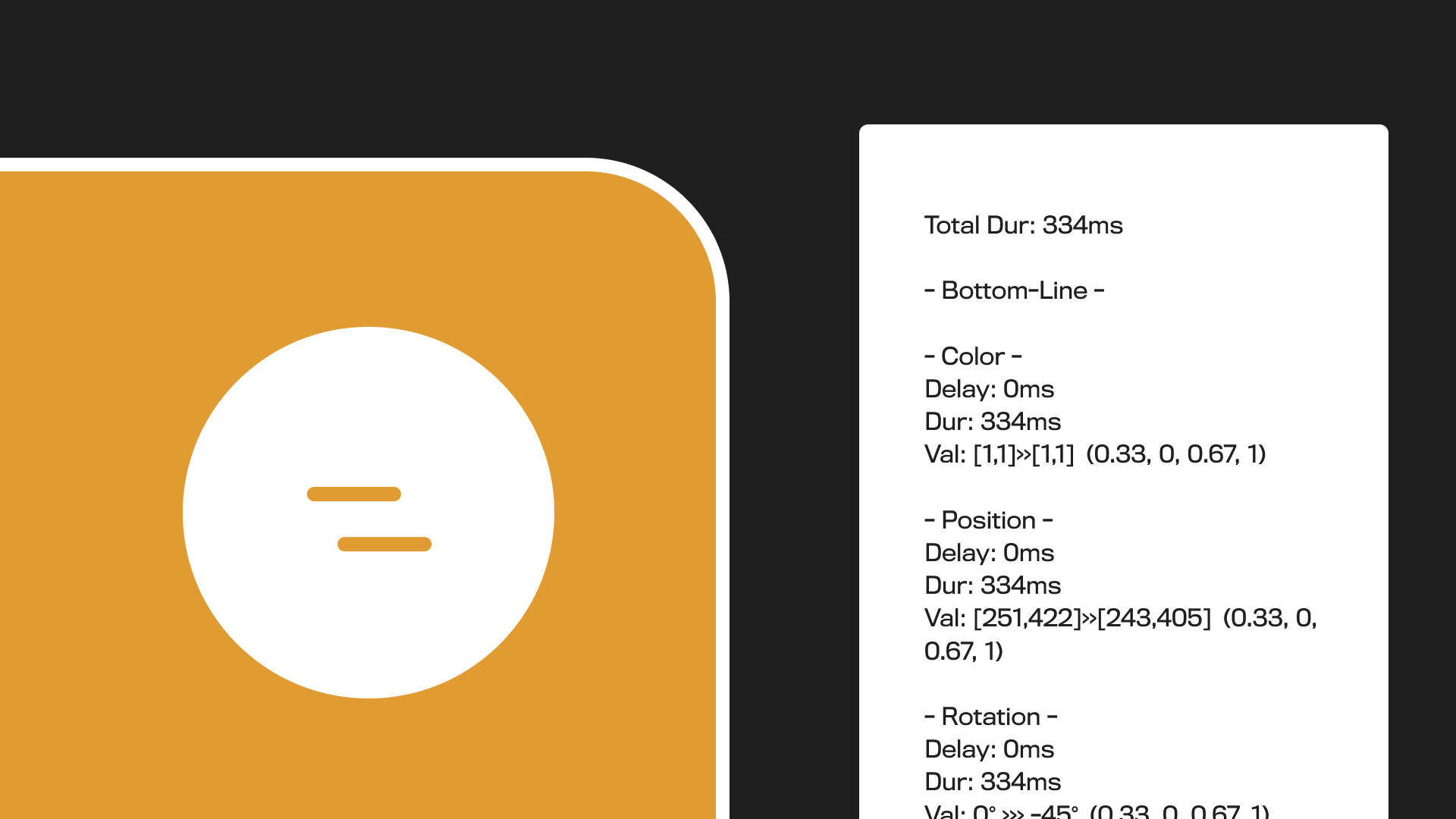
For advanced motion concepts like Physics, Accelerometers, Particle Systems, or 3D models, a more manual process is required to find a 1:1 translation. Like anything in this process, having a discussion to understand the code parameters will inform the right design strategy.
Pro tip: Building a template library of your motion systems is extremely valuable for consistency and efficiency (easing curves, durations, components).
Get Started With Motion
At first glance, motion in design might seem too complex to break down into design system-appropriate building blocks. But, with these techniques, we can start to eliminate motion-paralysis and build systems that enable quicker and more innovative ways for product development.
Adopting motion into our design systems means better codebases, platform-wide UX consistencies, and greater moments of delight for our users.
Credits: This article was built on the insights from Alla Kholmatova, Gleb Kuznetsov, Zhenya Rynzhuk, Aristide Benoist, and Issara Willenskomer
