→ Pour la version en Français, c’est par ici
Design Systems have become a key part of my everyday work… And from discussions around me, it seems that it is now the case for a lot of people ;)
After reading Alla Kholmatova’s book last year, I was lucky to attend the first European conference on the subject in March. All of this strengthened my conviction that, in the future, every brand and every product will use a Design System, simple or comprehensive, strict or loose, mono or cross platforms…
I keep hearing various definitions, so let me start by saying what a Design System isn’t: it is not a Sketch library, no more than a Style guide or a Pattern Library… Actually, it’s all of this and so much more!
A Design System is the single source of truth which groups all the elements that will allow the teams to design, realize and develop a product.

So a Design System is not a deliverable, but a set of deliverables. It will evolve constantly with the product, the tools and the new technologies.
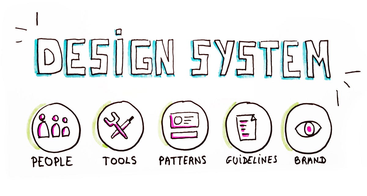
As Jina Anne describes perfectly in this conference, the System is composed of tangibles and non-tangibles elements :
- Tools for designers & developers, patterns, components, guidelines…
- But also -and it’s often the most difficult thing to achieve- some abstract elements such as brand values, shared ways of working, mindset, shared beliefs…
Style Guide or Pattern Library: what’s the difference?
As it should be clear for you now, the Style guide and the Pattern Library are just some of the deliverables of a Design System.
A Style Guide -as indicated by its name- will focus on graphic styles (colours, fonts, illustrations…) and their usage.
A Pattern Library will integrate functional components and their usage.
Most of the current Design Systems contains both, just as Shopify for example which as one tab “Visuals” for its Style Guide and one tab “Components” for its Pattern Library.

Why are we talking about that today?
The desire for factorizing design and components is not new. But we can see that the trend has accelerated during the past years. More and more companies are based on digital supports and do not even have Graphic guidelines for print anymore!
For a long time, digital was treated like the “side project”: we use to make Graphic guidelines for printed elements and then, add some extra-guidelines for the digital… Who has never received 300 pages of graphic guidelines with only 6 pages about digital? I have… And as a Designer, that’s not the kind of inputs I expect from a brand...

We must now close the gap between print and digital around a shared language that will evolve with time. Design System is the direct descendant of the Graphic guidelines but it’s more mature and more integrated into the teams' workflow. We also now have the tools which allow us to build and share systems of components.
The fundamental purpose of a Design System is to facilitate the work of the teams. So the first question we need to ask ourselves is not “What should I put inside my Design System?” but “Who is going to use it and how?”.
Once our target is defined and we have a first idea of what is already in place in the company (What is working or not? Which is the level of maturity of the teams about this subject? What are the existing tools?…), it will be easier to know where to start.
#1. Purpose and shared values
Where are we going? Why? And How?
Before starting anything, it’s essential to align teams around a clear set of shared goals. It will help to build a vision and making sure everyone looks in the same direction. These goals will evolve with time and it’s normal. We just have to make sure that changes are broadly communicated.
As for the values, they are like great ideals that will guide our choices, according to the brand objectives. We need to make sure that what we’re designing does not differ from these key values.
Beside these brand and product values, we could also define some team values that will bring each collaborator around a shared state of mind.

#2. Design Principles

First thing to keep in mind: Design principles are so much more than just the visual aspect of a product…
Design principles are the guiding sentences that helps the teams to reach the purpose of the product thanks to the design.
They will help the teams to make meaningful Design decisions.
I will take the example of Medium. One of their Design principles is “Direction over choice”. Thanks to that principle, instead of designing a regular text editor with unlimited choices of colours and fonts, they opted for a simpler one. That allows the author to focus on the content of his article rather than on its visual aspect.

Design Principles must guide design choices
#3. Brand identity & language

The identity should be defined in line with the strategy and the objectives of the brand. Alla Kholmatova speaks about the “perceptual patterns” that she lists as follow:
- Colours
- Fonts
- Spaces
- Shapes
- Icons
- Illustrations
- Photographies
- Animations
- Voice and tone
- Sounds
All of this forms the alphabet of the Brand.
It’s a good starting point but that’s surely not enough to speak a language! We have to go further to use this alphabet to compose some words and then associate these words to obtain sentences that make sense. These brand elements will need some rules which will be, in a way, the grammar and the conjugation of the System.
In our Design System, it’s materialized by guidelines, do’s and don’ts and “good examples” of use.

This will ensure the design teams use the “right combinations” of this language, those who make the brand so unique and recognizable.
#4. Components & patterns

Components & Patterns are at the heart of the System. All the previously mentioned elements will help us to create them and deliver a consistent experience.
The components are our LEGO blocs. They’re used in Sketch by designers, and directly in the code by developers. Their functional behaviour must be specified.
As for the patterns, they are the building instructions that will allow us to use these components in a logical and consistent way, across all the products.
In the image below, we can clearly see that a component will be specified with technical and functional documentation, whereas a pattern will give recommendations about how to use it:

If you wonder which component you should develop first for your system, you can run a component prioritization workshop.
Best practices
Besides the documentation, that is often directly linked to the System, best practices will accompany teams in a larger and more transversal way.
The idea is to dig into the general best practices and extract only those who make sense, based on the product and the level of maturity of the teams.
Best practices will help the teams to form and develop their technicals skills.
We can almost say that there is one kind of Design System per team or product… To define our own, we have to ask ourselves the right questions:
- How many people will use this system?
- What is their profile and are they mature enough on the subject?
- How many products must we align? On how many platforms? How many different technologies (Angular, React, others…)?
- What degree of consistency do we want across our products?
All these answers will help us to define the most appropriate kind of Design System.
In her book, Alla Kholmatova gives us some inspiration:
Strict or loose?

A strict system will have a comprehensive and detailed documentation and will be fully synchronized between design and development. There will be a strict process for introducing a new pattern in the System. A strict system should be very broad in order to cover the majority of cases the teams may encounter.
A loose system will leave more space for experimentation. The System is here to provide a framework for the teams while preserving some freedom. Designers and developers are free to use it or not, regarding their particular needs for their product.
From my experience, we have to find the right balance between strictness and flexibility: a very strict system might repel designers and developers who will not want to use it. On the other side, can we still speak about Design System if this one is too loose?
Modular or integrated?

A modular system is made of interchangeable and reusable parts. It suits well for projects that have to scale quickly and that have to adapt to multiple user needs. The negative part is that it’s often more expensive to realize (because it can be difficult to make modules that can be independent while working well together). This kind of system will particularly fit large scale product as e-commerce, finance and governments websites. For a modular system, it will be very interesting to work with atomic design in mind.
An integrated system focus on one unique context. It’s also composed of parts, but these parts will not be interchangeable. This kind of system suits products that have very few repeating parts and that need a strong and often changing Art Direction (portfolios, showcases, marketing campaigns…).
Centralized or distributed?
The organization around Design Systems is really important for its evolution and scalability. In this article, Nathan Curtis details the different types of models. Here are two of them:

In a centralized model, one team is in charge of the System and makes it evolve. This team is here to facilitate the work of the other teams and has to be very close to them, to be sure that the System covers most of their needs.
In a distributed model, several people of several teams are in charge of the system. The adoption of the system is quicker because everyone feels involve but it also needs team leaders that will keep an overall vision of it.
In each case, I advise allowing everyone to participate and make suggestions to improve the system, in order to create a sense of membership.
Place your system on a scale
The idea will be thus to position our system on these three scales, in order to define the kind of system that we want:

A Design System is a full product, which is going to help the actors of a project to build other products.

As for every good product, it will have its own backlog and will have to build itself in an iterative way, keeping the users (designers, developers, PO…) at the heart of the approach.
The more integrated the system will be with the designers and developers workflows, the more effective it will be.
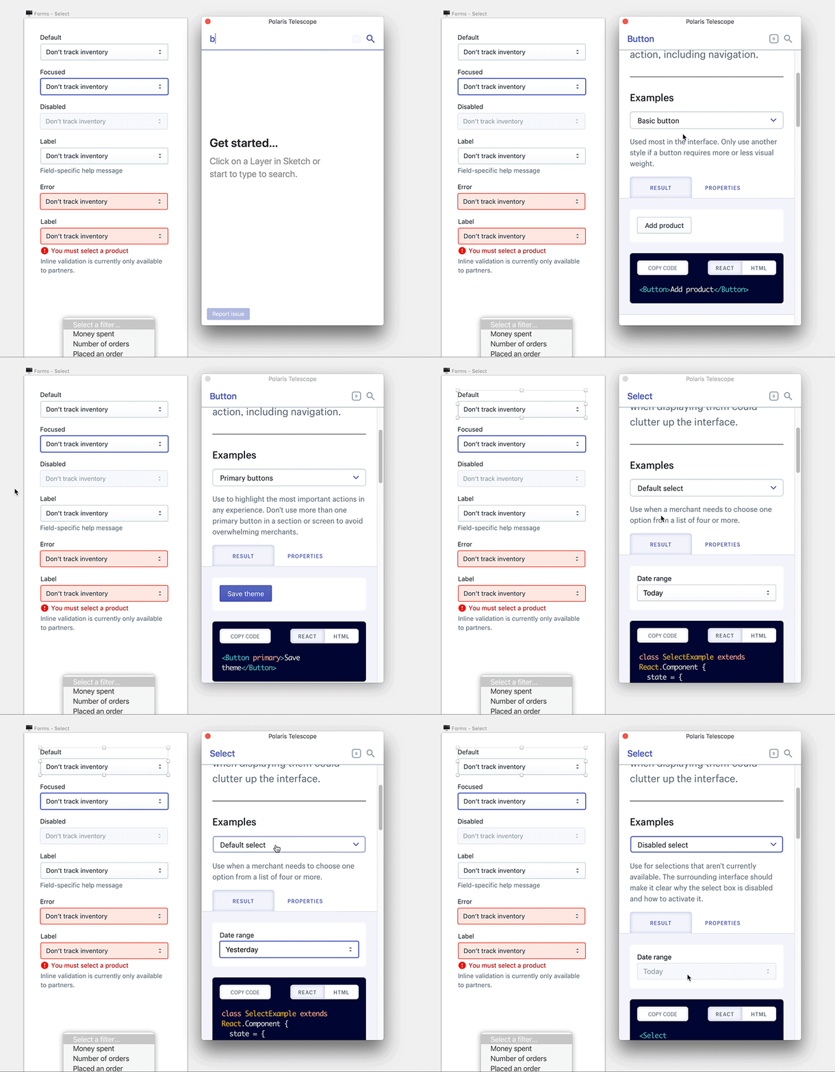
One really good example of this integration is the Sketch plugin of Polaris that displays the components and documentation of the system directly in Sketch, so the designers have everything they need during the conception phase:

And all of this is only a beginning!
I’m convinced that the future will provide us with a lot of great technical evolutions to facilitate our lives and to allow us to concentrate on the experience of our products and our users ;)
Sources
- Alla Kholmatova’s book on Design Systems
- Every article of the fabulous Nathan Curtis
- Conferences and writings by Jina Anne
You can also find other examples of very good Design Systems on this repo:
Thanks for reading!
